
Since the Pinterest phenomenon came about, I have easily been able to keep track of several of my favorite things! I know what I like, and I like a lot, apparently. However, one of the few things that has not, and dare I say, will not make it on my list of favorites is painting. I loathe detest abhor do not like to paint. I really, REALLY have to love you A LOT to even consider helping you paint. I have friends who love it. It relaxes them. It soothes them. It takes their mind off other cares. Not me. Despite my aversion to painting, it must be done. So, I paint on.
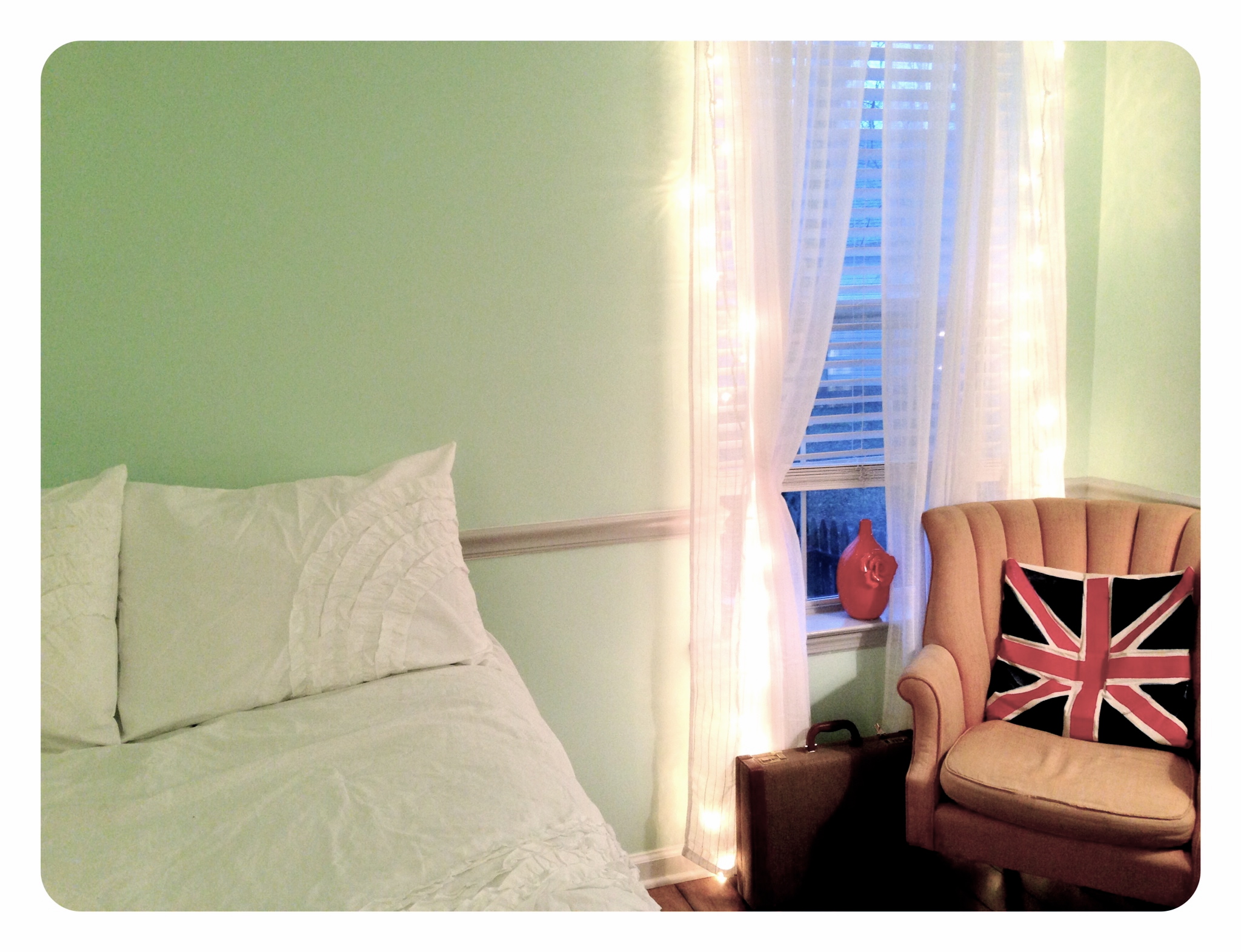
Last year my husband and I invited Macey, one of our “kids” (she’s not really ours, but she seems like she is!), to live with us. She moved into our guest room and was quite content with the hodge-podge of decor and color scheme, as we hadn’t yet gotten to refurbish that part of the house. So, for her big 20th birthday this year, we gave her a chunk of change to do a bedroom make-over. She and I have lots of cross-over with our styles, so it’s been fun to help her make it her own. She really wanted a mint color for the walls, so I searched and searched and finally found one I loved: Mint Hint by Valspar. It’s super-duper light mint, but as is the case with greens, light is better unless you want to feel like you’re in the middle of the St. Patrick’s Day parade in downtown Chicago. It turned out to be a lovely color. Macey and I both agree!
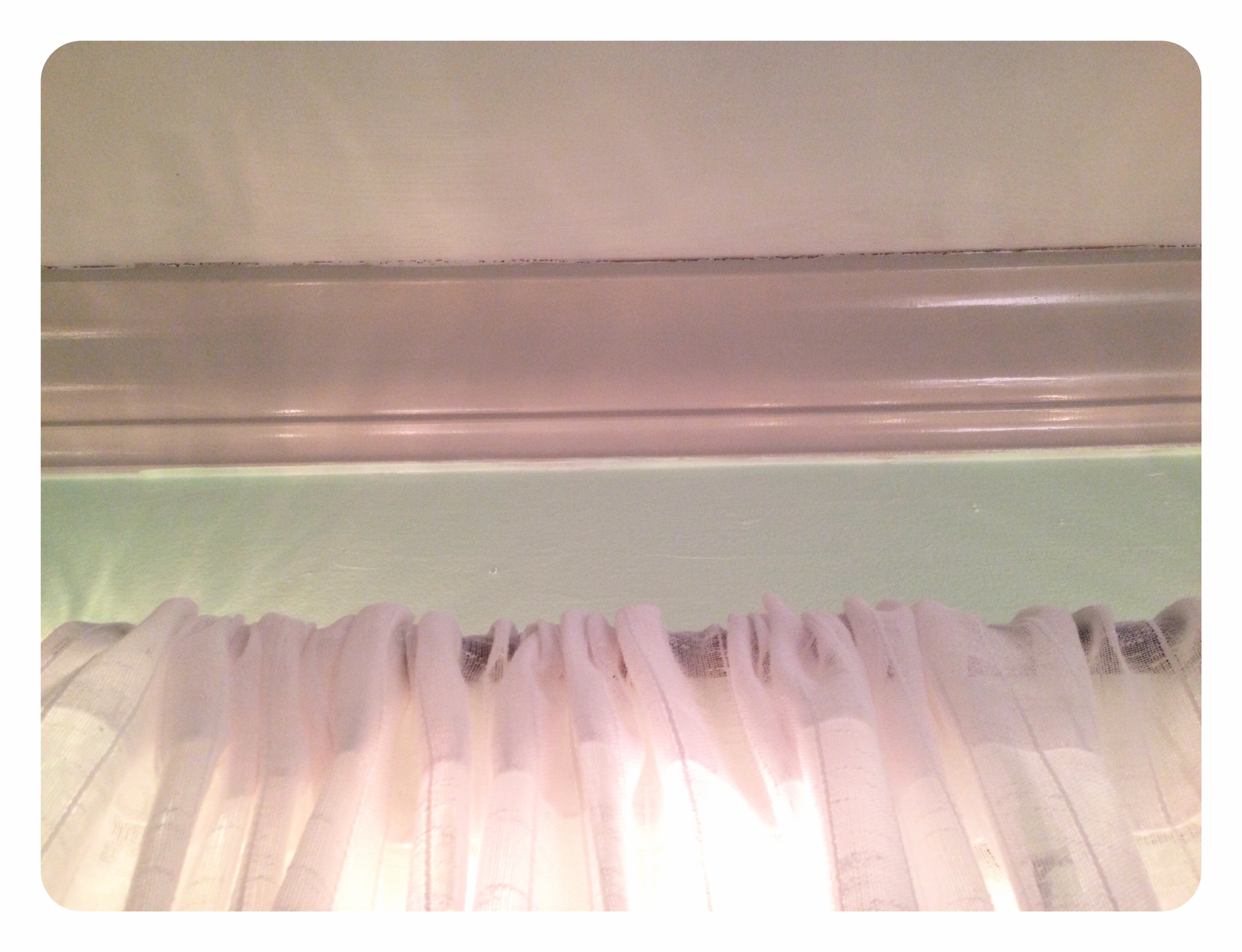
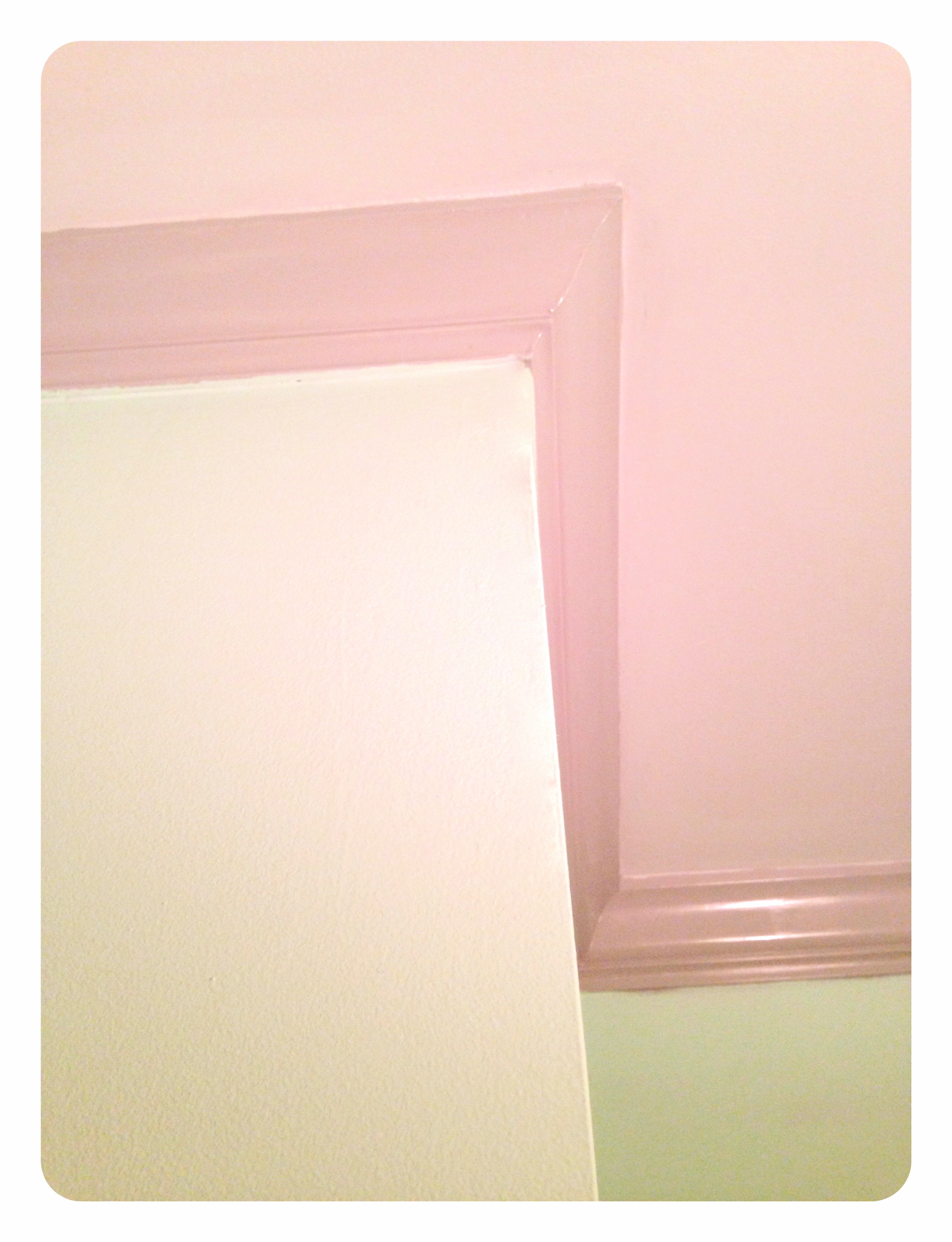
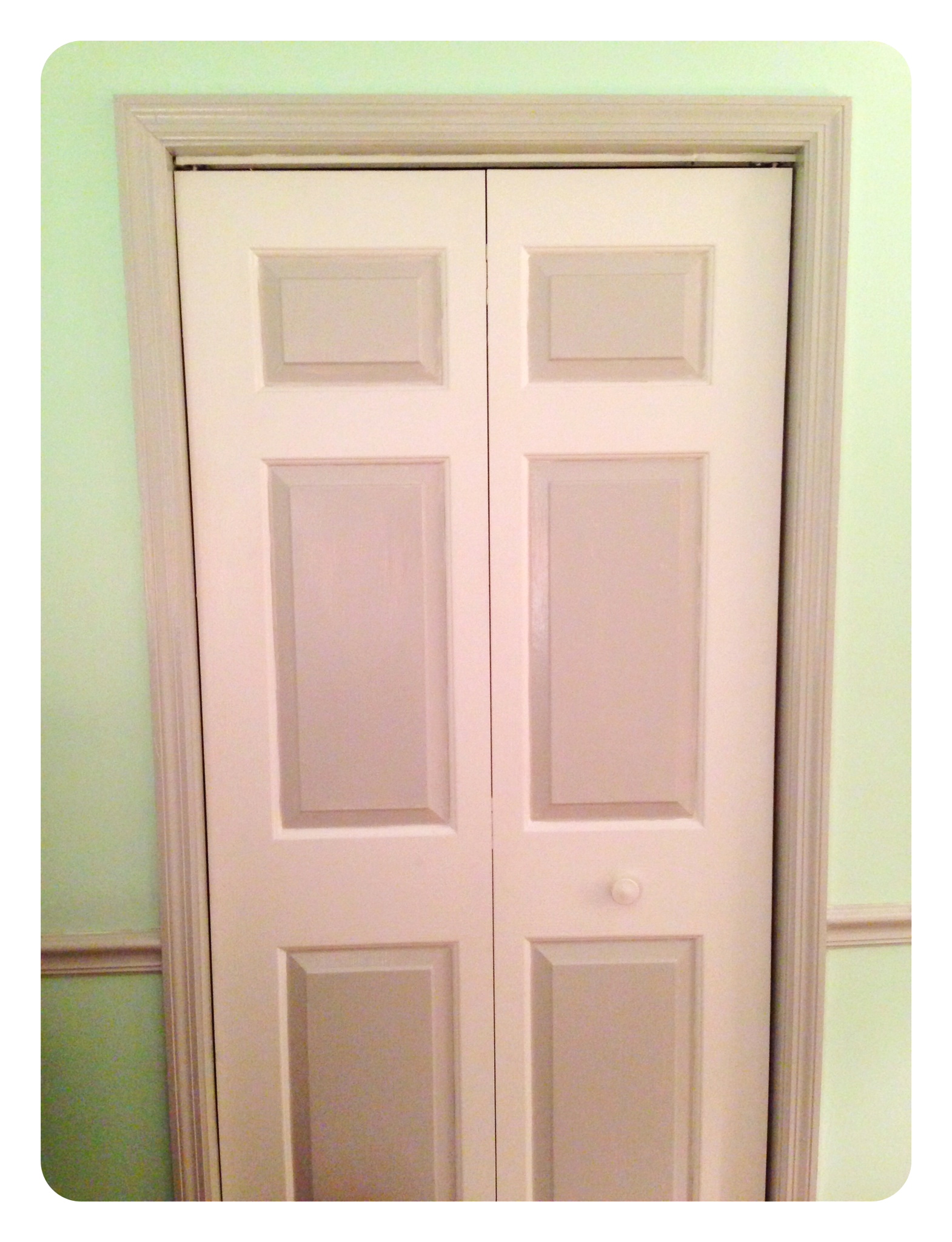
Her room also has crown molding around the top border of the room and a chair rail that goes all the way around the room as well. I love chair rails. They remind me of Downton Abbey. Anyway, I wanted to do something to accentuate the minty loveliness to match Macey’s sense of style. So, I chose Filtered Shade by Valspar, and got it in a high-gloss finish to make it pop against Mint Hint.
The result? An exquisitely delightful retreat for a creative 20-year old!
Finally, brethren, whatever things are true, whatever things are noble, whatever things are just, whatever things are pure, whatever things are lovely, whatever things are of good report, if there is any virtue and if there is anything praiseworthy—meditate on these things. | Philippians 4:8

One thought on “decor tip: cool color contrast”